The way humans perceive and respond to digital information is highly predictable. By taking some of the patterns, into account, you can ensure that your business will grab the attention of your desired audience as they navigate through a sea of digital options.
What are the magical rules?
The number of websites is well over one billion, a number that continues to grow by the second. These sites represent the sheer volume of information accessible to people surfing the internet. Yet far too much of this information is hidden behind poorly designed websites, pages so cluttered or unclear that no savvy browser not to mention newbie could begin to access the treasures within.
It doesn’t have to be this way. If every website and mobile app today would simply follow a few important rules, the internet could be a much friendlier, organized place. If you and your business follow these rules, you’ll discover that not only will your users find useful information but also you’ll be able to direct users to exactly what you want them to see.
Everyone moves their eyes in the same fashion, regardless of background;
As the internet offers far more information than people can take in, companies need to fight for attention. Say you’re looking to book a hotel room in London. You search Google for accommodations, and are immediately given 500 million options. Obviously there’s no way you could consider each one – but such is the peril of information overload in the twenty-first century. The prominence of computers and the internet have prompted an exponential rise in the quantity of available information. In fact, scientists at IBM have estimated that the data created over just the last two years makes up 90 percent of all the information currently in existence!
In the 1950s, for instance, people could choose among two or three TV channels. But today you can access just about every program ever made, and whenever you want, through cloud services. Yet the amount of information that people actually pay attention to is limited by the cognitive capacity of the brain. For instance, research has suggested that a person’s short-term memory is only capable of storing about four pieces of information at a time. So whenever the information presented exceeds your brain’s capacity, you start missing out.
For example, studies have found that having a phone conversation while driving causes you to stop noticing some 50 percent of your surroundings – red lights and pedestrians included. Eeek…
You probably have heard of the dating app called Tinder. Users glance at profile pictures and in that split second, decide whether they’re interested in dating that person. Some 1.2 billion Tinder photos are swiped every single day!
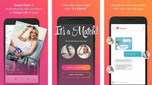
Tinder offers us a great example of how rapidly a person can form an opinion about a certain subject. How exactly do people make such quick decisions?
Most of our choices and judgments are influenced by processes that occur before we’re conscious of what we’re actually looking at. So instead of weighing pros and cons rationally, our subconscious mind makes a near instantaneous judgment based on a first impression. So if you run a website, in order to get people to engage, you need to find a way to make your site appeal to a user’s subconscious. But most websites are drab, colorless things that rely on long streams of text instead of visual appeal to engage viewers. This sort of design can lead to a site being overly complicated and hard for a person to follow.
Building an engaging website requires some visual complexity – that is, a perfect balance of color and detail. For instance, bright, engaging colors are key to grabbing a person’s attention. Once that’s done, the rest of your information needs to be presented in a clear, easy-to-understand format that doesn’t overburden the quick-thinking subconscious.
In certain studies, participants were shown website screenshots so rapidly that they couldn’t possibly process them all consciously. Nonetheless, the sites that rated the highest for usability and trustworthiness were those that were visually appealing. This is known as the halo effect, when one prominent feature of a product is so appealing that it influences a person’s judgment about the project as a whole.
We’ve all been there: standing in a supermarket aisle, facing ten different brands of a certain product. Some people know exactly what they want, but if you don’t, you’re likely to pick an option located in the center of the shelf. That’s because we perceive the world and make decisions based on what’s known as the middle bias. Our eyes don’t move systematically from side to side when we see something, but instead jump around in a predictable pattern. As you might have guessed, this pattern tends to reach its end in the “center.” Studies conducted with candy have found that human’s middle bias is so powerful that test participants would choose a sweet placed in the center, even if their favorite candy was included in the group but far off to the side. So if you want someone to click on a link, the best place for the link to exist is smack dab in the center of the screen.
But placing items centrally isn’t the only way to get people to notice them. You can also highlight specific options to boost the chances of selection. This tends to work especially well when people aren’t on the hunt for something specific, or when they’re experiencing a cognitive load such as while multitasking. It’s simple: the brightest colored option will often be the one that’s chosen.
After scanning around jerkily, however, a person’s eyes will then move horizontally. To turn this fact to your advantage, it’s essential to carefully consider which information you’ll organize in rows and which in columns. For example, Dell Computer built on this fact to list its computer models in columns on its website, and other information, such as prices, in horizontal rows. Yet researchers found that customers were more focused on the horizontal rows and therefore focused their search on the cheapest computer. But when Dell switched the information around, customers spent more time looking at the products, now on the horizontal plane, and less time focusing on price.

Customers don’t actually want unlimited options, but instead a curated selection. But remember if you want your customers to get something done quickly, make it easy. But if you want them to carefully consider certain information, a bit of disfluency can go a long way.
Good luck with with it:)
Love, Marietta